Site News ~ Most Recent First
-
A small curved line in the bottom margin may not seem like much at first glance—but it has opened the door to an especially interesting 10¢ Plum project.
Hans Reiche listed five plate flaws for the 10¢ Plum Admiral in his 1987 booklet, The Admiral Flaws. Until now, however, none of those five reported flaws had been represented on Marler and Beyond.
That has now changed.
The first reported example has been added to the database as Reiche No. 4, described by Reiche simply as a “curved line in bottom margin.”
This discovery gives collectors a new reason to examine the lower margins of their 10¢ Plum stamps—particularly copies with enough margin visible to reveal marks outside the engraved design. Margin varieties are easy to overlook, especially on closely trimmed examples, but they can provide some of the most satisfying detective work in Admiral philately.
For now, Reiche No. 4 remains an early entry in what may become a much larger story. A second example, and especially one that can be plated, would be an important next step toward confirming the flaw as a repeatable constant plate variety. It may also help determine which plate carried the mark and whether other examples of the same variety have been hiding in collections all along.
And, of course, there are still four more 10¢ Plum flaws from Reiche’s list waiting to be found.
Collectors with 10¢ Plum material are encouraged to check the bottom margin for a curved line matching Reiche’s description. A clear scan, a well-centred copy, or any information that helps establish a plate position could turn this first report into the beginning of a newly documented group of 10¢ Plum varieties.
This stamp is recorded as Reiche No. 4, whose original description reads: “curved line in bottom margin.”
By WGB and Admiral Intaglio

-

A Flaw with a Home Address
Some plate flaws are intriguing because they are bold. Others become truly memorable when they can be placed precisely on a printing plate. This 2¢ Carmine example is fortunate enough to offer both.
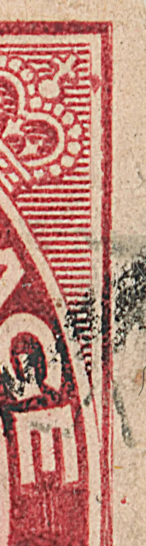
After the plate flaw in the upper right has been noted, the feature that is next likely to catch the eye is the defective transfer at the upper right: the right frame is thin opposite the “TAGE” of POSTAGE, the right side of the upper-right spandrel is weak, and the indents inside the right frame remain visible. There is also a distinct guide dot in the right margin at centre.
The stamp is a Marler type O2, which limits it to plates 4 (part), 6 (part), 7 or 8. Leopold Beaudet’s plate 8 notes on the plate proofs at LAC allow us to easily identify the position as 8LL71.
Hans Reiche appears to have recognized this same flaw in The Admiral Flaws in 1987, describing a dot in the upper-right spandrel from the original die. His diagram and description provide an important earlier record of what is now a particularly satisfying plated constant plate variety.
For now, this is a fine reminder that a modest guide dot and a damaged frame can sometimes combine to tell a remarkably complete story.
~WGB with some help from Admiral Intaglio
-
A New 2¢ Carmine Discovery
Every once in a while, an Admiral decides it’s tired of behaving like a normal stamp and steps forward as something a little more interesting. Our latest culprit is a newly identified Constant Plate Variety on the 2¢ Carmine, currently known from just two examples – a genuinely shy CPV that seems reluctant to appear on stage.
Both stamps show an unusual inking in the left numeral box: instead of the clean white interior we expect, there’s a delicate sliver of extra red along the left edge of the box, almost as if someone has taken a microscopic nibble out of the “white” area and filled it with ink. On a busy design like the 2¢ Carmine, it’s the sort of thing your eye can skate past unless you’re looking very closely – which, of course, we are.
Marler Type R15… with a twist
The first question, naturally, was “Where does this fit in Marler?” Our working answer is: Marler Type R15, but with a twist.
Marler’s description of R15 focuses on a retouch in the lower left frame and numeral box area. In our case, the lower left frame junction line region doesn’t quite match his written description, yet the overall behaviour of the stamp points toward the same general family of retouches and the example dated July 23, 1915, also helps. The key is that the vertical line of the numeral box has been re‑worked, and the retouch continues above the box into the frame.
What makes these two examples special is that the repair seems to have had a side effect: instead of just strengthening a weak line, it has changed the physical surface of the plate along the edge of the numeral box.
A low‑angle retouch and a damaged numeral box?
Here’s the working theory that emerged from the discussion with RVS:
- A tool was used to retouch the vertical line in the left numeral box, extending the repair above the box.
- If that tool had not only re-cut the line, but also somehow damaged the adjacent "white" box area - which of course was the surface of the plate.
- That damaged area would be slightly incuse - just deep enough to hold a film of ink that normal wiping couldn't remove.
- On the printed stamp, the result is a narrow red strip inside what should be a pure white part of the design.
Think of it as an over‑enthusiastic touch‑up: the engraver went in to fix a line and, in the process, created a tiny ink‑holding gutter along the side of the box. The retouch did its job, but it also left us with a distinctive plate flaw that appears each time that position is printed – exactly what we look for in a CPV.
Same plate position? The evidence so far
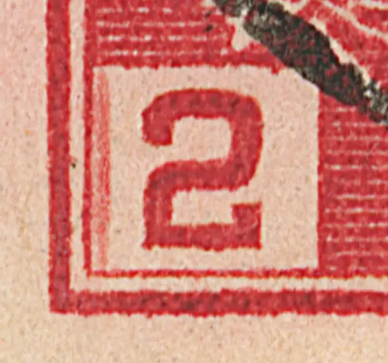
With only two examples, we have to be cautious, but the evidence strongly suggests they come from the same plate position. The shape and length of the added red inside the numeral box match closely from one stamp to the other, and the surrounding frame and retouch details line up in a way that would be unlikely if we were just dealing with random inking or transient damage.
At this stage, the variety is:
- Denomination: 2¢ Carmine (Admiral issue).[2]
- Feature: Retouch of the left numeral box and frame, with a shaving‑induced plate flaw that produces extra red inside the numeral box.
- Zone: Lower left of the design (numeral box and adjacent frame).
- Marler Type (provisional): R15 – pending further examples and a more formal write‑up.
View the technical data along with a larger image here.
As always, confirmation will come from more stamps: if additional copies can be found with the same feature, we’ll be able to lock down the plate position and update the database accordingly.
Why this matters (and why it’s fun)
From a distance, this might look like just another “tiny line in a busy design.” But new CPVs like this are exactly what keep the Admiral study alive and evolving:
- They show how sensitive the plates were to human intervention – one slightly tilted tool and suddenly the white box isn’t completely white anymore.
- They remind us that Marler’s listings are a foundation, not a finished catalogue. There is still room at the table for newly documented varieties and refined type assignments.[1]
- They give collectors a new “needle in the haystack” to search for in their 2¢ Carmine piles, which is a very respectable way to spend an evening.
And, of course, there’s the simple joy of the chase: the first stamp raised the question, the second stamp made it serious, and now we wait to see who finds number three.
Calling all 2¢ Carmine hunters
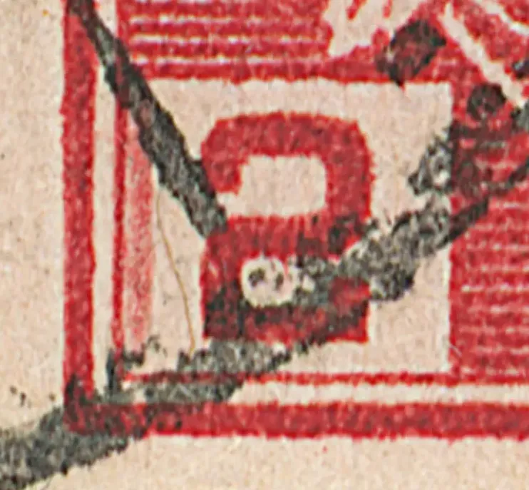
If you have a stack of 2¢ Carmine Admirals close at hand (and really, who doesn’t?), now is a good time to take another look at the left numeral box. You’re hunting for:
- A clear retouch in the vertical line of the box, continuing up into the frame.
- A very fine strip of extra red along the right edge inside that left numeral box – as if a little ink has crept into the “white” area.
If you think you’ve found a match, please let us know. A scan would be very helpful.
~ Admiral Intaglio and WGB, with most of the insight offered by RVS
NOTE: Subsquent to the publication of this note, Leopold Beaudet, using the plate proofs at LAC, has determined the plate position to be 75LL88.

-

A new 5¢ Blue Zone 4 retouch reference page has been added, and it should make the plate positions of stamps from this interesting group much easier to determine. The page currently shows 102 Zone 4 retouches and uses a more precise menu style that better matches the underlying descriptions and search terms.
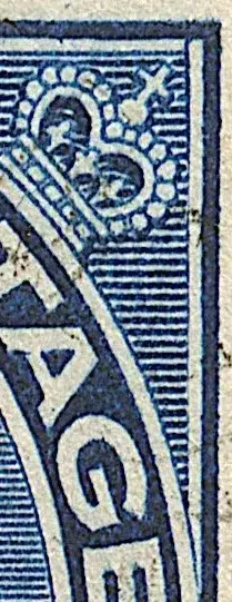
This is especially helpful for the many 5¢ Blue UR retouches, where the differences can be very subtle. Features such as extended lines, doubled strokes, spurs, bends, and small marks can now be compared more efficiently, even when earlier notes use slightly different wording.
This new page is best viewed on a larger monitor, since the tighter menu layout is designed for clearer navigation and more exact filtering.
The close-up of the upper right retouch on the left starts ‘above line 1’ and ends ‘about line 10’. See if you can plate it using the new reference page. -
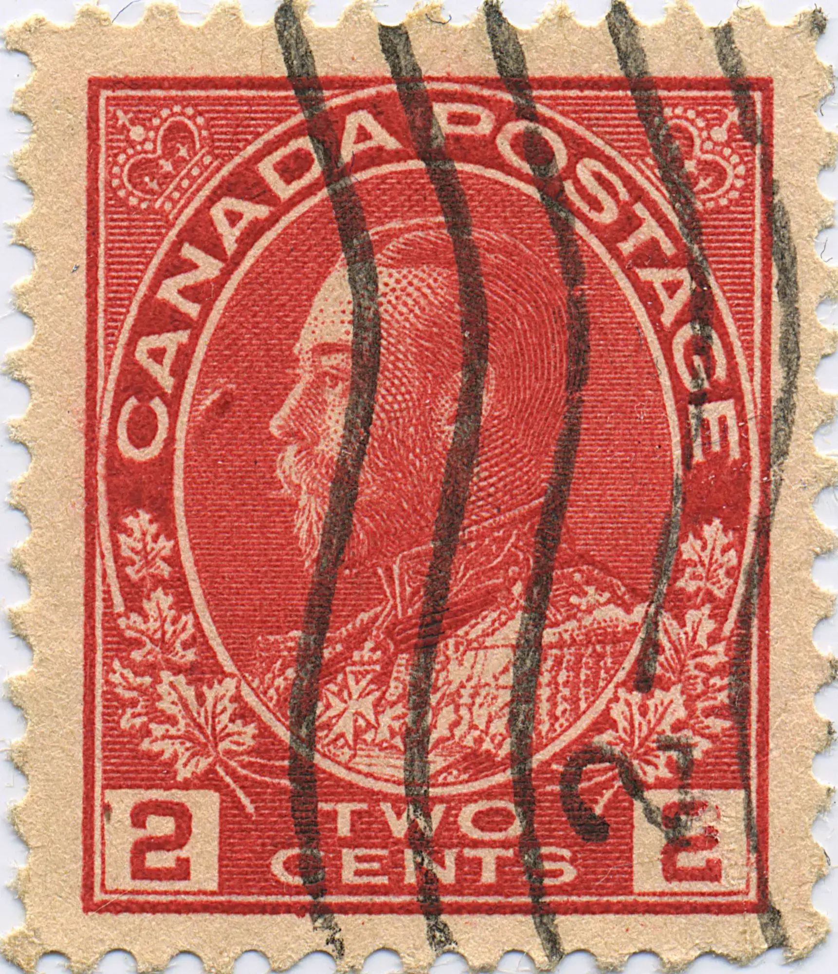
Hans Reiche’s 1987 booklet, The Admiral Flaws, includes a diagram that closely resembles this stamp.
For some time, Marler and Beyond has shown a single tentative example of this flaw. Recently, however, a second confirming example has been found. This new example gives us fairly high confidence that the variety has been correctly identified as Reiche’s No. 70 on the 2¢ Carmine.
This CPV is one of the most impressive constant plate flaws reported on any value of the Admirals. A close examination reveals an especially interesting feature: the white, unprinted area lies immediately beside a strong red ink mark near the “CA” of CANADA.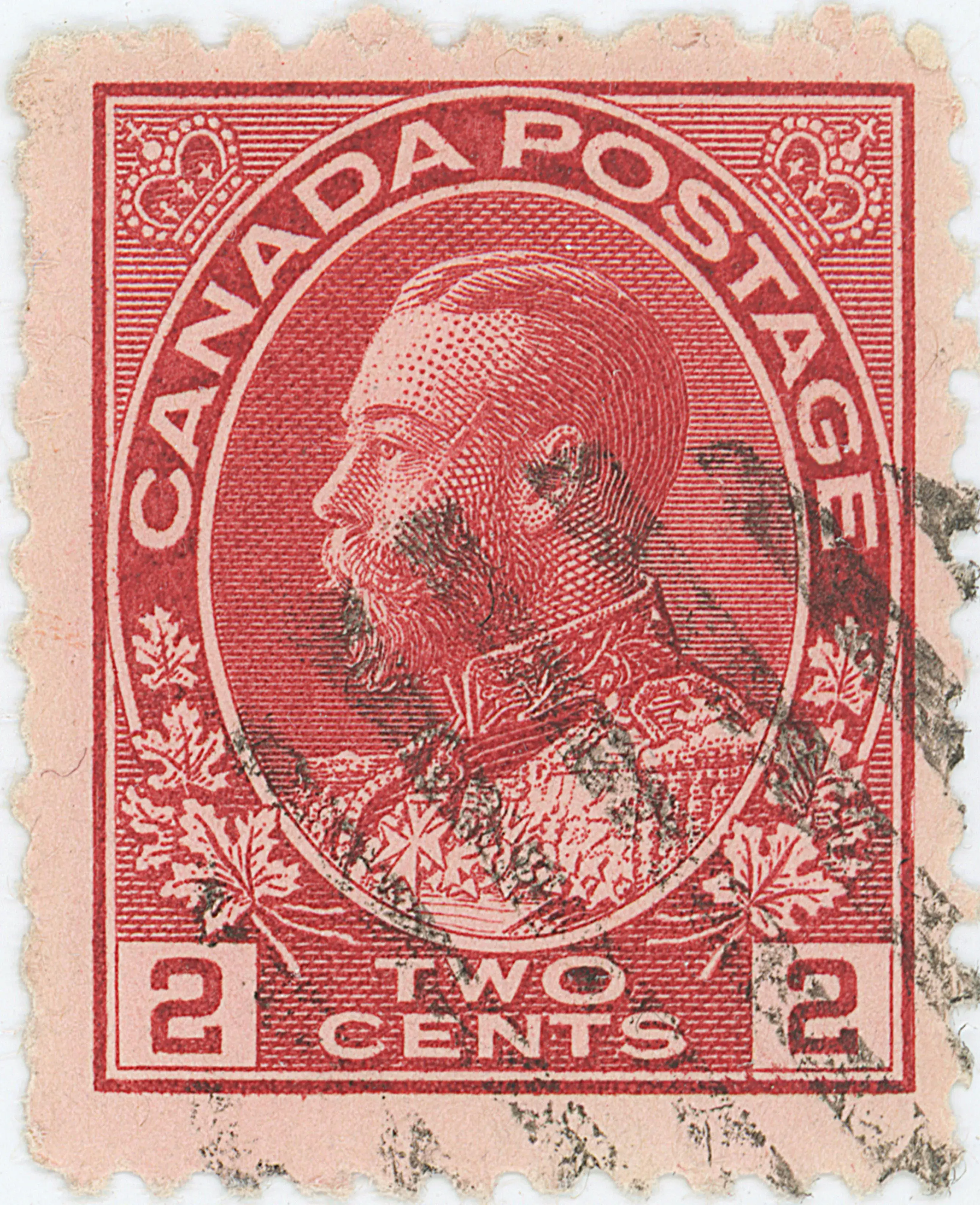
A similar effect can be seen on the 2¢ Carmine from position 10UL44, where a band of colour appears adjacent to a band of white. One reasonable explanation is localized damage to the plate, perhaps caused by a glancing blow or scraping contact with a hard object. Such an incident could have displaced the plate surface rather than simply cutting or removing metal. One part of the disturbed area may have become raised, smoothed, or otherwise unable to retain ink, producing the white paper-coloured mark. At the same time, an adjacent edge, burr, roughened area, or slight depression may have retained extra ink and printed as the strong red mark.
This kind of plate-surface displacement would explain the paired appearance seen here: a white, ink-denying area immediately beside a stronger ink-retaining area. The similarity to the flaw at 10UL44 suggests that both may have resulted from a comparable disturbance to the surface of the printing plate.
